
Reports
The Reports tab summarises test health for the project — pass/fail breakdowns, execution activity and coverage at a glance.
- Use Refresh to recompute after a run.
- Numbers are derived live from your Executions and links — there’s no separate data to maintain.
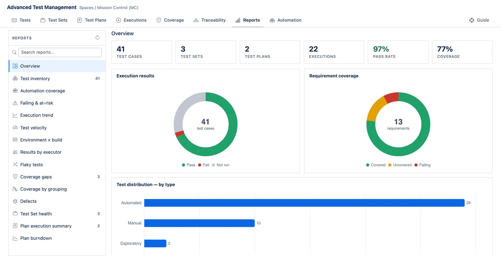
Pick a report on the left. Overview opens first: the project’s totals, its pass rate and its coverage, with the two donuts underneath.
Test inventory
Section titled “Test inventory”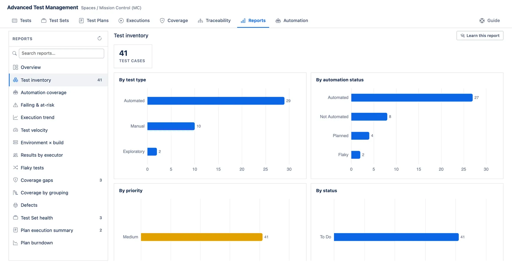
What it answers: what kind of tests do we actually have, and who owns them?
How to read it: each donut splits your Test Cases one way — by test type, automation status, priority, workflow status, assignee and component. A big slice is simply the most common value, not a good or bad thing.
What to do: look for slices you didn’t expect — a huge “Unspecified” usually means a field nobody fills in, and an assignee holding most of the library is a single point of failure.
How it’s counted: every Test Case in this project, one vote each. Empty values are grouped as “Unspecified”. Each chart shows only the top 8 values — if you have more, the smallest are not drawn and are not added to an “other” slice. Component uses only a case’s first component.
Automation coverage
Section titled “Automation coverage”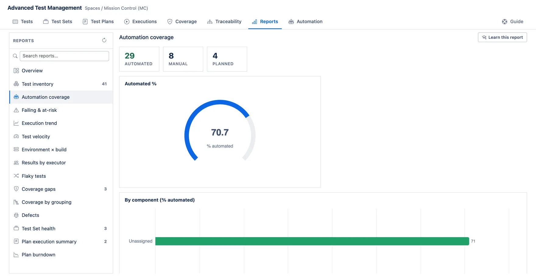
What it answers: how much of our testing runs without a human?
How to read it: the gauge is the share of Test Cases that are automated. The tiles count cases, not runs — this is about how the library is written, not how often it executes.
What to do: pick the components with the lowest percentage and highest run frequency; these should be prioritised for automation first.
How it’s counted: a case counts as automated when EITHER its Test Type OR its Automation Status is “Automated” — they are two separate fields and teams use them differently. “Planned” comes only from Automation Status, and only when the case is not already automated. Everything else is counted as Manual — including cases where neither field is set at all. So a library where nobody fills in Test Type will report as almost entirely manual. Per-component figures show the top 8 components only.
Failing & at-risk
Section titled “Failing & at-risk”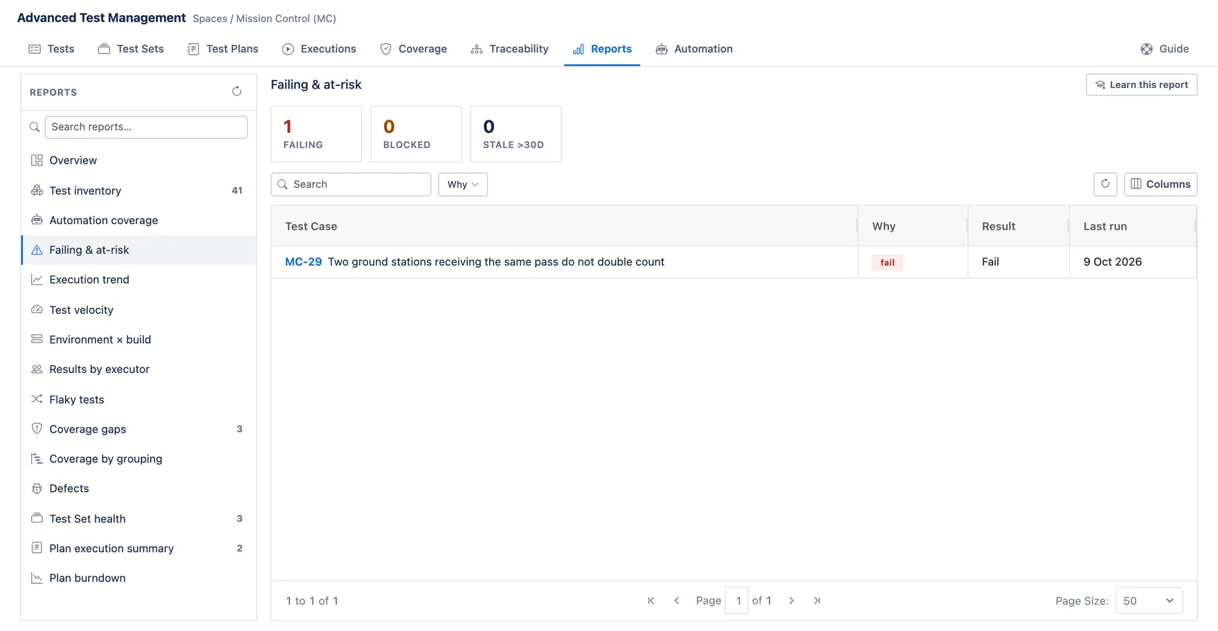
What it answers: what should I look at before shipping?
How to read it: three buckets. Failing = last run failed. Blocked = last run couldn’t complete. Stale = passed once, but so long ago you shouldn’t trust it.
What to do: failing first, then blocked (often an environment problem, not a bug), then stale — re-run them to find out whether they still pass.
How it’s counted: from each case’s Last Execution Result field, so it reflects the most recent run only, not history. “Stale” means last executed more than 30 days ago and applies only to cases that are not already failing or blocked. A case that has never run is not at risk — it’s simply untested, and won’t appear. The list shows at most 100 rows.
Execution trend
Section titled “Execution trend”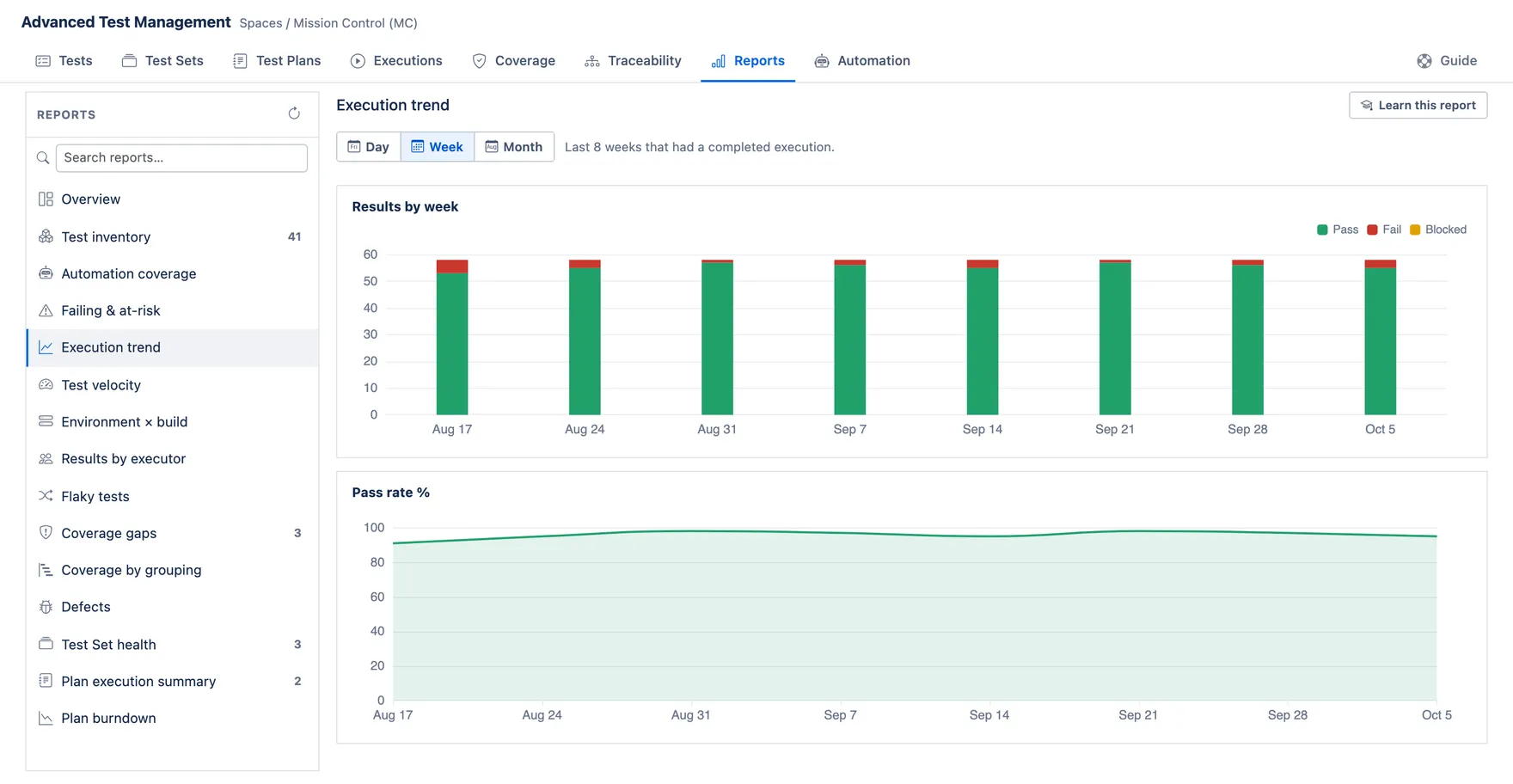
What it answers: is our quality getting better or worse over time?
How to read it: stacked bars are results per week; the line is pass rate. The line matters more than the bars — bars grow simply because you ran more tests.
What to do: a falling pass rate while volume is flat means real regression. Both falling usually means testing stopped, not that quality improved.
How it’s counted: only completed executions, bucketed by when they completed. Use the Day / Week / Month toggle to change the bucket size — all three are calculated together, so switching is instant and re-reads nothing.
Each view keeps the last 30 days, 8 weeks or 12 months that had activity. Weeks start Monday; all three are UTC, so a late-evening run can land in the next day’s bucket.
In both views a bucket where nothing was run is omitted entirely rather than drawn as zero — so the axis can hide quiet periods, and two neighbouring bars may be weeks apart. Check the labels before reading a slope. Pass rate = pass ÷ (pass + fail + blocked + skipped); “not run” rows are ignored.
Test velocity
Section titled “Test velocity”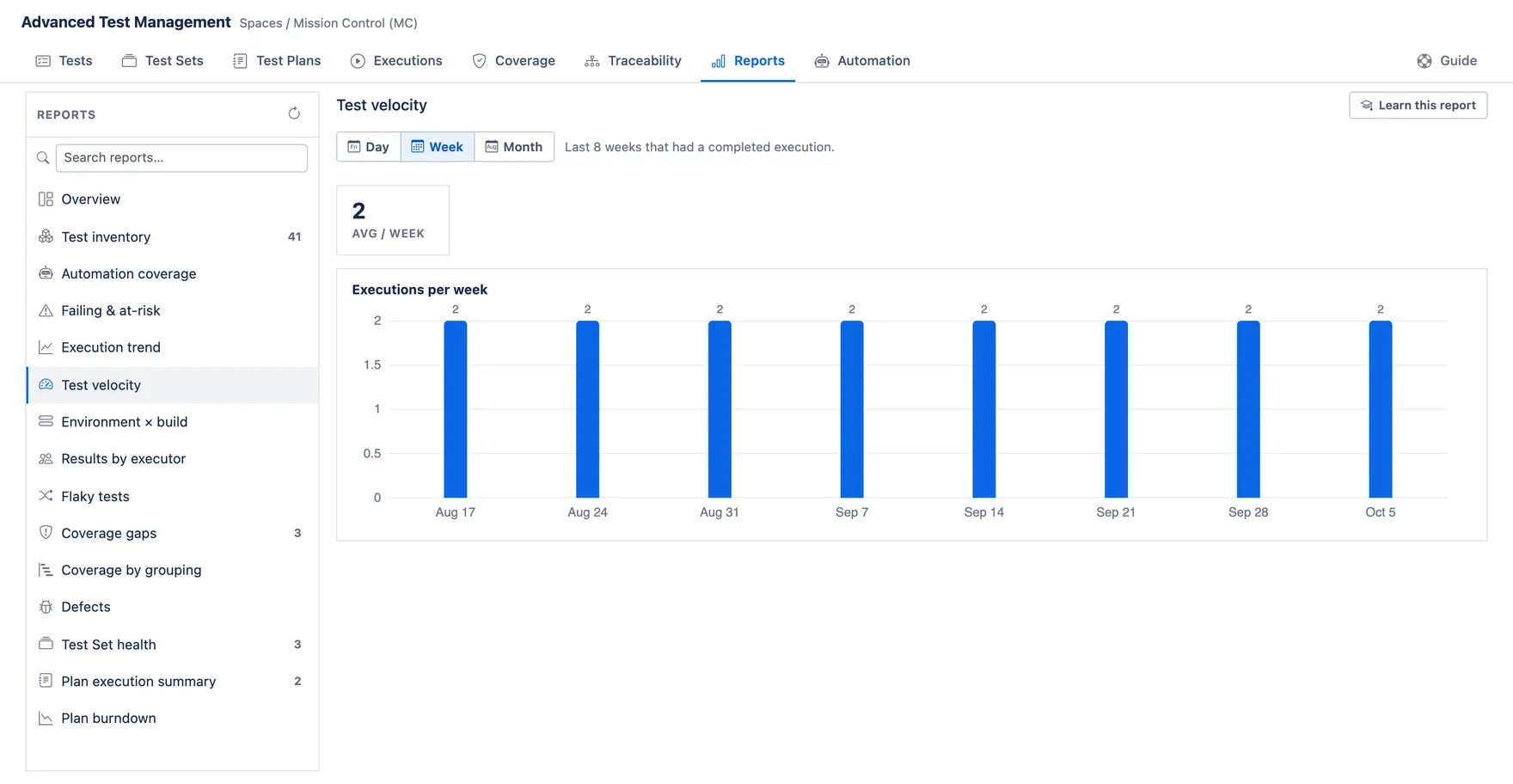
What it answers: how much testing are we getting through?
How to read it: one bar per bucket counting executions — whole runs, not individual test cases. A 200-case run and a 2-case run each count as one. Use the Day / Week / Month toggle to change the bucket size; all three are calculated together, so switching is instant and re-reads nothing.
What to do: use it for capacity and planning, not quality. A drop before a release is worth asking about. Month is the honest view of a long-term trend; day is for seeing whether testing actually happened this week.
How it’s counted: completed executions per bucket. Each view keeps the last 30 days, 8 weeks or 12 months that had activity; weeks start Monday and all three are UTC.
The average is per ACTIVE bucket, not per calendar period — quiet stretches are skipped entirely, so if you test in bursts it reads higher than your true pace. Shown to one decimal, because per-day averages are usually below 1.
Environment × build
Section titled “Environment × build”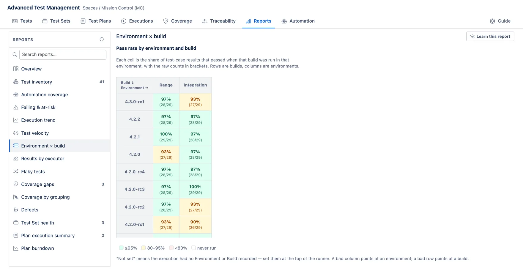
What it answers: is it broken everywhere, or just in one place?
The idea: the same tests get run against different builds (versions of your product) in different environments (staging, production…). If a build fails only in one environment, the build is probably fine and the environment is not. This grid puts the two side by side so you can tell those apart.
How to read it: rows are builds, columns are environments. Each cell is the pass rate for that pairing — the share of test-case results that passed — with the raw counts in brackets. Always read the brackets: “67% (2/3)” is three tests and means very little; “67% (670/1000)” is a crisis. The colour is only a shorthand for the percentage and knows nothing about how many ran.
What to do: a bad column = an environment problem, and the build is likely fine. A bad row = a genuinely bad build, wherever you put it. One bad cell = something specific to that pairing, usually configuration. A dash means nothing ever ran there.
How it’s counted: completed executions only — a run still in progress does not appear here whatever its environment. Set Environment and Build at the top of the execution runner; both stay editable after the run is complete, so you can label a run you already finished. Automation imports set them from the CI payload.
Runs with those fields left blank are grouped under “—”, so a team that does not fill them in gets one big meaningless cell. Values are matched exactly, so “staging” and “Staging” are two different columns — and since the grid shows only the first 8 environments and 12 builds it meets, typo variants can silently push real ones off the chart. Pass rate ignores “not run” rows.
Results by executor
Section titled “Results by executor”What it answers: who is doing the testing?
How to read it: one row per person, counting test-case results they recorded, with their pass rate.
What to do: use it to spot workload concentration and knowledge silos. Do not use pass rate to judge people — a low rate usually means someone is testing the riskiest area, which is valuable, not careless.
How it’s counted: per row, not per execution — marking 50 cases counts as 50. Attributed to whoever recorded the result, from every execution, with no date limit. “Not run” rows and rows with no recorded user are excluded. Top 20 people by volume.
Flaky tests
Section titled “Flaky tests”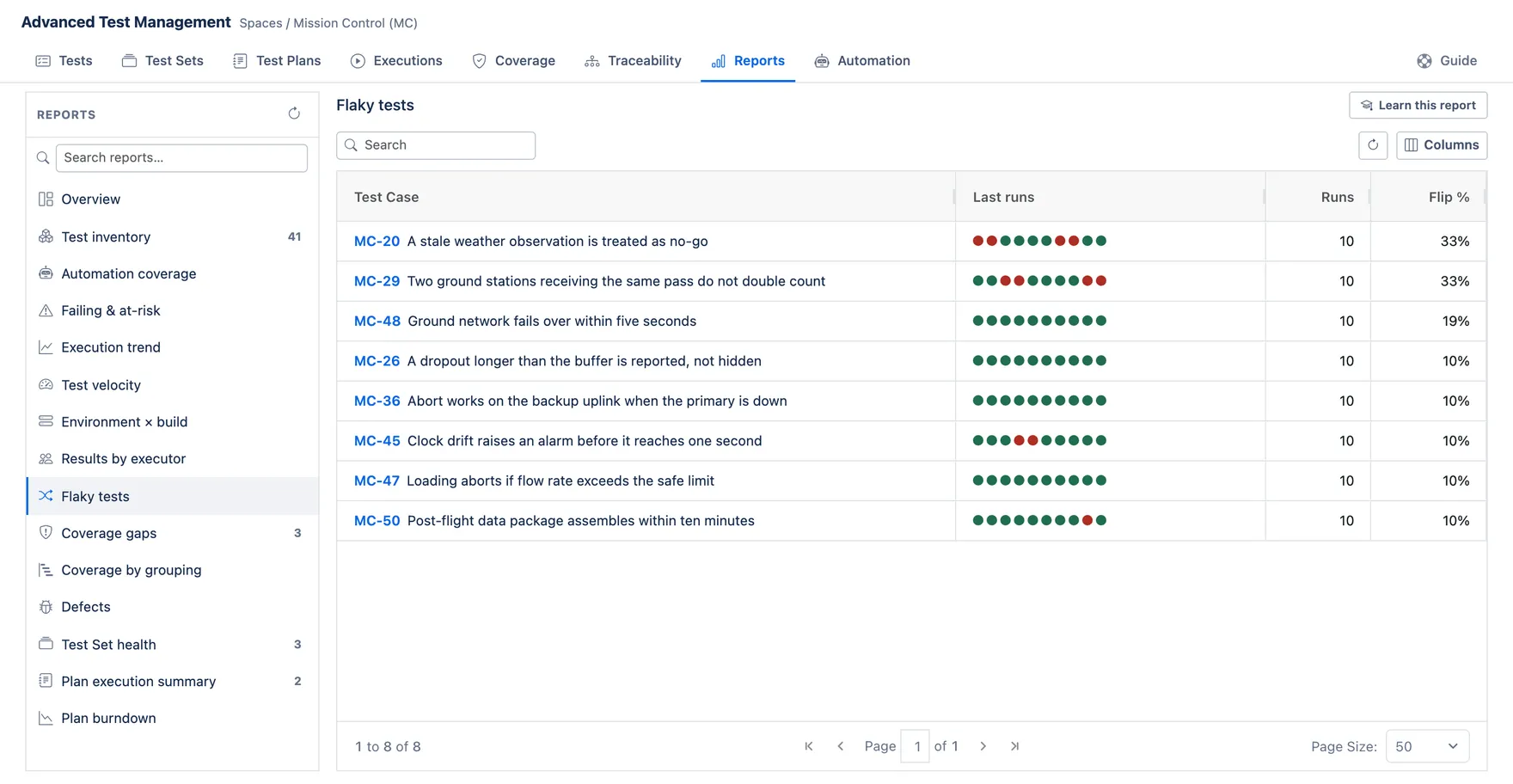
What it answers: which tests can’t make up their mind?
How to read it: a flaky test gives different answers without the product changing. The dots are that case’s results oldest → newest; the percentage is how often the answer changed between consecutive runs. All-green or all-red is consistent — and consistent is good, even if it’s consistently failing.
What to do: flaky tests are worse than failing ones, because people learn to ignore them and then ignore a real bug. Fix or quarantine the top of this list.
How it’s counted: a case needs at least 3 recorded results to appear, and at least one change. A “flip” is any change between consecutive results — pass→blocked counts, not just pass↔fail, so environment trouble can look like flakiness. Flip % = flips ÷ (results − 1). Dots show the last 10 results; the list shows the top 30. Ordered by when each result was recorded.
Coverage gaps
Section titled “Coverage gaps”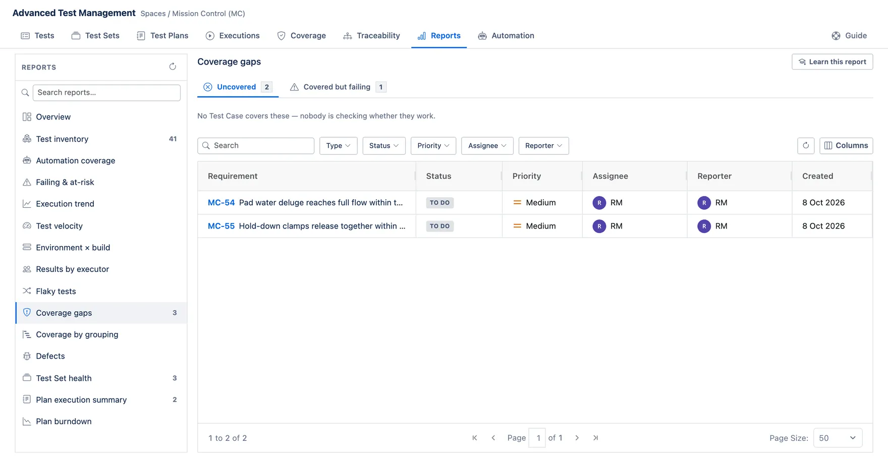
What it answers: which requirements are we not testing — or testing badly?
How to read it: two tabs. Uncovered = no Test Case is linked to that requirement, so nobody is checking it. Covered but failing = it is covered, but a covering test last failed — that tab also names the failing Test Case. Each row carries the requirement’s own status, priority, assignee, reporter and created date, so you can triage without opening every issue.
What to do: uncovered is a blind spot — you don’t know if it works. Failing is a known problem. Blind spots on important requirements are the bigger risk.
How it’s counted: a requirement is “covered” when a Test Case is linked to it with a “Covers” link — the link is what counts, nothing infers coverage. Which issue types count as requirements is configured per project in Project settings, so this report only sees the types you nominated. Status comes from each covering case’s Last Execution Result.
Coverage by grouping
Section titled “Coverage by grouping”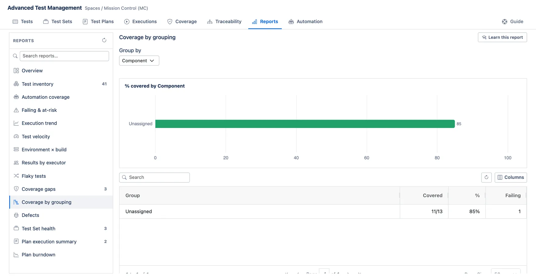
What it answers: which parts of the product are best and worst covered?
How to read it: requirements rolled up by component, with the percentage that have at least one linked Test Case. Look at the low percentages against how much that area matters.
What to do: aim effort at low coverage on high-risk areas. 100% coverage everywhere is rarely the right goal.
How it’s counted: same “Covers” link rule as Coverage gaps. A requirement counts as covered even if its tests are failing — this measures whether something is tested, not whether it works. Grouping uses a requirement’s first component; requirements with none are grouped as “Unassigned”. Top 12 groups by size.
Defects
Section titled “Defects”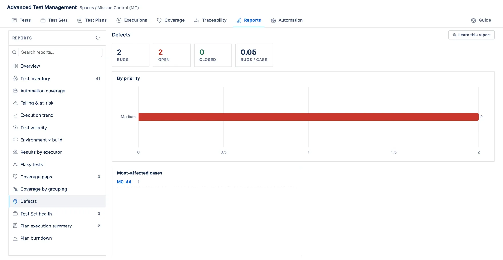
What it answers: what is our testing actually finding?
How to read it: counts of bugs, split open/closed and by priority, plus which Test Cases produce the most. “Per case” is bugs divided by Test Cases — a rough measure of how productive the library is.
What to do: cases that find many bugs are your valuable ones — run them more. A rising open count near a release is a schedule risk.
How it’s counted: every Bug in the project, not only ones raised through this app — so bugs from support or elsewhere are included and the ratio reads high. “Open” means the status category is not Done, which follows your workflow, not a fixed status name. A bug ties to a case through its link to that Test Case; bugs with no such link count in the totals but not in “by case”. Priority shows the top 8; recent shows 12.
Test Set health
Section titled “Test Set health”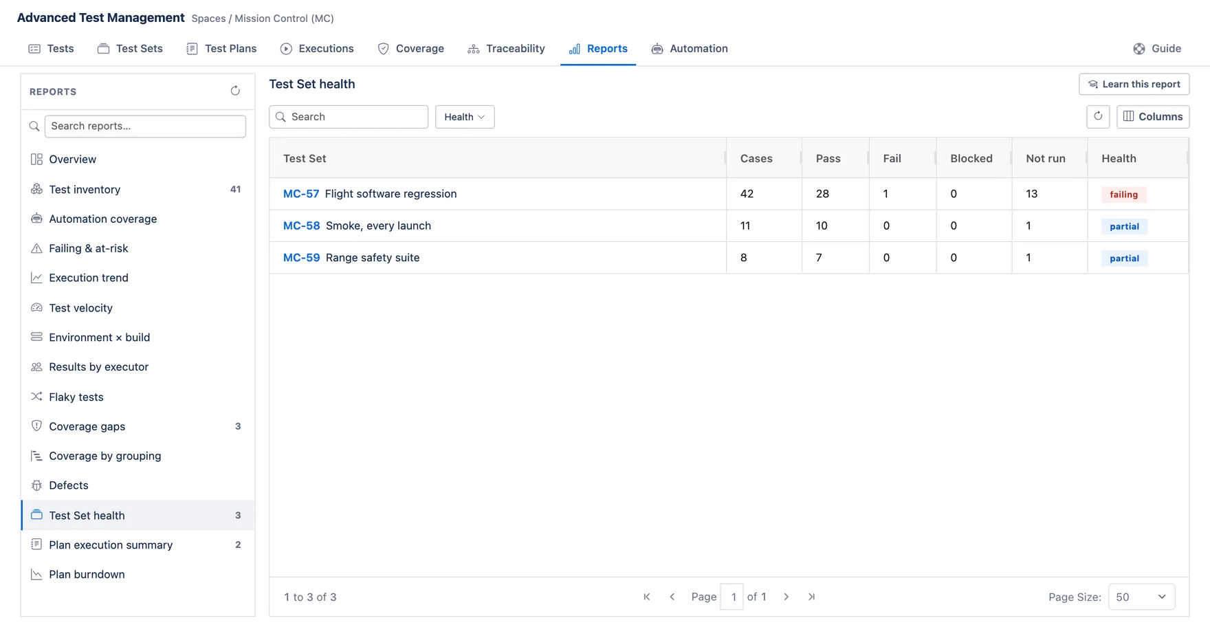
What it answers: which of my reusable suites are in good shape?
How to read it: one row per Test Set with a single health word: healthy (everything passed), failing, blocked, partial (some cases never ran) or untested.
What to do: treat “partial” with suspicion — a suite people half-run is giving false comfort.
How it’s counted: from the latest results of the set’s member cases, with a strict precedence: any single failure makes the whole set “failing”, however many cases passed. Then blocked, then partial, then healthy. A set is “untested” when it has no members or nothing has run.
Plan execution summary
Section titled “Plan execution summary”What it answers: where does each release plan stand?
How to read it: one row per Test Plan with its pass/fail/blocked/not-run counts across its scope.
What to do: read it as release readiness — “not run” is the number that decides whether you actually know your state.
How it’s counted: across the plan’s effective scope — its Test Sets plus directly-added cases, minus anything explicitly excluded, and a case appearing in two sets is counted once. Results come from each case’s latest run.
Plan burndown
Section titled “Plan burndown”What it answers: are we going to finish testing this plan in time?
How to read it: the line starts at the plan’s total scope and drops as cases get run. Flat means nothing is being executed. Reaching zero means every case has been run at least once — not that they all passed.
What to do: compare the slope to your remaining time. Flat early is the warning sign.
How it’s counted: scope = the plan’s effective, non-excluded cases. One point per completed execution, in completion order; remaining = scope minus the distinct cases run so far, so re-running a case never moves the line twice. Only executions started from this plan count — running the same cases from a Test Set or ad-hoc will not burn the line down.